
Go to Squircle Jail!
July 28, 2026
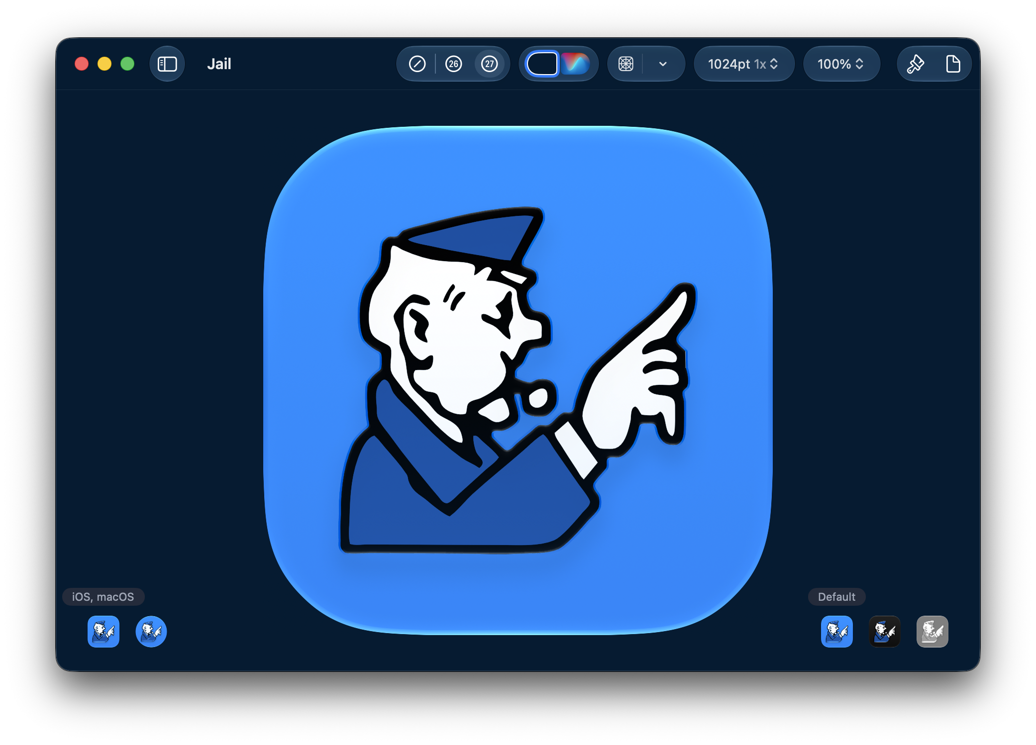
I really really like Louie Mantia's recent essay, 'The Shape of Apps'. It addresses Apple's recent changes to app icons on the Mac, most notably the introduction of squircle jail. Unlike a lot of the banal complaining I see on social media, the essay is thoughtful and attempts to punch at the other side of the debate: what are we gaining with these changes that people aren't seeing?
It's by far the best piece of commentary on the topic. The point of this post isn't to rehash it. Instead, I want to take one of Louie's points and push it even further:
The reality we all witnessed over the last almost-20 years is one where our macOS Dock had a few apps that were not developed by some indie developer who cared. The apps we didn’t want to use—but had to for one reason or another—looked very out of place.
The number of out-of-place apps on my machine has always been far more than a few. Anyone who's worked at BigCompany knows that corporate computers are stockpiled with enterprise slopware. (I'm sure it's important software, just not important to me.) Not to mention students, and the endless amount of invasive software they need to install for test-taking or reading textbooks.
In terms of icons, my work machine has always been a mess compared to my snowflake Mac I use at home. Pre-Tahoe my App Launcher looked like a twenty-car pileup on the highway. I suspect this aligns with the experience of most Mac users.
The reality is that most people use software made by large companies, not by indie developers who carefully craft their icons to match the style of the system. Large companies have different priorities, namely:
- Their own branding
- Their own design system
- Cross-platform frameworks
Far down on that list is “platform conventions”. The majority of people who build this software never ask themselves, "What does it mean to be a good Mac app?" And honestly, that's fine! It's not wrong, it just is. Not everyone cares about artisanry, probably for the best.
They won’t care if their icon looks out of place. They will care, however, if their icon looks bad (i.e. if it's been thrown into squircle jail). If the icon looks bad, they will fix it. And by making the icon look correct within a squircle, it looks far less out of place than it did before. Squircle jail is a forcing function that raises the floor of the look and feel of macOS for most users.
Louie is right that Apple’s squircle mandate is a trade-off! I'm going as far as to say that the trade-off is worth it.
I can understand the pain of the indie developer who designed (or spent thousands of dollars on) a gorgeous icon for macOS Big Sur, only to be forced to redo it for Tahoe. That's painful, and it sucks.
Some have argued there should be an escape hatch for these folks — but I understand why Apple hasn’t done this either. An escape hatch for one is an escape hatch for all. If there were an easy way out of jail, everyone would take it. And now we're right back where we started.
On the other side of the coin, there are new developers like me. I'm currently building my first app for Apple's platforms, and I'm relieved that I only need to consider (i.e. pay for) one icon that will not only work on every platform, but also fit in.
And the icons being created for today’s platforms don’t suck. They look great! Just look at the work that Parakeet is doing. One could argue the squircle is far less of a constraint on icons than the Liquid Glass design style. Case in point.
I don’t think Apple’s mistake is the squircle, nor its enforcement via squircle jail. Its mistake was the half measure taken by macOS Big Sur, which introduced a design where icons were encouraged to be squircles, but also encouraged to extend beyond the squircle's boundaries with additional flourish. If this was an attempt to ease developers into where we're at today with Tahoe and Golden Gate, I think it was a mistake. A rip-the-bandaid-off approach may have been less painful.
Changes to icon standards should happen about as frequently as Apple changes the port on an iPhone. It should be remarkably rare. The best outcome now is that Apple sticks with squircle icons on the Mac for at least a decade to come.
I'll end with this great post from Louie on Mastodon, in the midst of discussion about his essay:
The bounds of a squircle are no different from the millions of constraints that *define* the macOS and iOS platforms we design and develop in. Of course it is an Apple-defined constraint. Most platform guidance we follow to make apps are Apple-defined constraints. Do not forget: we design and develop apps within the macOS container. We have to acknowledge that space when we design and develop apps.
And:
There was a term from an old Human Interface Guidelines document I love: perceived stability. The idea that if apps share a certain way of thinking, the platform as a whole will feel more stable. Users will more easily comprehend how all apps work if they all work similarly. This is how Apple works. It has been true forever. We design menus with specific titles (File, Edit, View), not because they intrinsically make sense. We do it because it strengthens the familiarity of apps on the platform.